Sunday, December 18, 2011

Revit: Post-Revit Artistry


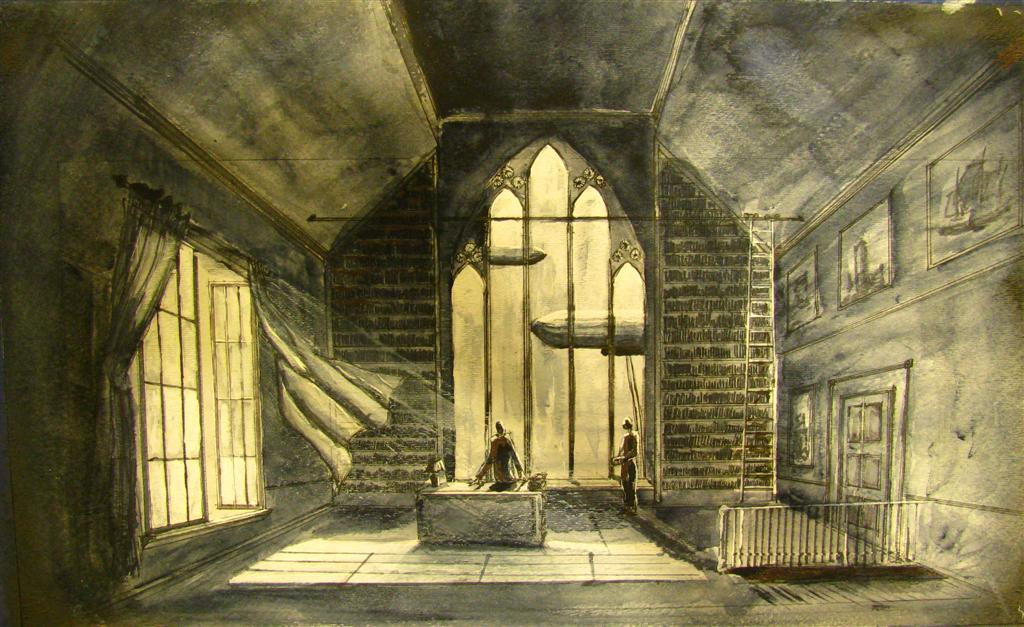
After the previous presentation, I wanted to explore using a combination of digital painting and image manipulation in Photoshop to create more impressionist, experiential images. I used this new method to render my elevations and perspectives for my final presentation for my design project. Every other student in my class chose to create photo-realistic images, so my project offered a counterpoint to the way that the majority of students and professional present their projects. I received a lot of positive feedback from my critics and classmates alike. When I asked what it was about the images that they preferred to the photo realistic images, I was unable to wheedle out any concrete answer—most were along the lines of ‘these images are just irresistibly pleasing to the eye’, ‘I don’t know, I just really like them’, or ‘it’s nice that your renders aren’t trying to be something they aren’t’. My hypothesis, based on my colleague’s and critic’s reactions and on the theory of impressionism is that these types of images attempt to connect to the viewer emotionally and aren’t just limited in trying to convey as much information as possible to the viewer.  Because these images are focusing on communicating emotion and experience to the viewer, the designer is free to focus on the overall quality of the space as opposed to having to detail out the entire digital model so that it will stand up to the scrutiny of photo-real, crisp images, which tends to lead to more powerful images. Also, because these images are rather vague in their detail, it allows the viewer to use their imagination to fill in the details of the space and the experience. This creates a personal connection and sense of ownership between the viewer and the image. Following are the images I used for my final presentation:


While creating these images, I found a systematic process that seems to work relatively well and can be easily adapted for each image. First, open your revit render in photoshop. Once open, use the adjustments tab located under image to modify the contrast, brightness, color, and saturation. I find that Curves and Saturation tools work best. To create a powerful and impressionistic based image, I find it best to exaggerate the light in the space and to increase the saturation of the image. It also helps to have an idea what color tone you would like for the final image. For this image I wanted more golden tones, so I started working on building up those yellows, browns, and oranges at this step in the process. It is also important to use complementary tones in the shadows of the image. For example, in this image, I tried to pull out indigo and purple tones in the shadows.

Curves


Saturation

Another easy opportunity to manipulate color and light is through digital painting. Using the eyedropper tool, select the area you would like to paint to get a base color that already exists in your image. Then manipulate the color in the upper-right of the screen. This is a good way to adjust the tones in the image. Below, I am changing a gray to incorporate more gold tones.

Color Matching

Digital painting is also very important in adding texture and contrast on large, flat surfaces that have little color or shadow variance. In this image, I needed to focus on the large white walls that frame either side of the image. When using the paint brush tool, be sure to manipulate the opacity and flow to create the desired effect. I suggest using an opacity between 15-40% and a flow between 50-80%. To manipulate the light quality, exaggerate highlights and shadows by painting in brighter highlights and deepening the color in the shadows.

Digital Painting

Once you are satisfied with your digital painting manipulation, you may start adding additional textures and entourage. I suggest using added textures in as few places as possible to maintain the simplicity of the image. Select the area where you would like to add the texture, then create a new layer and drag and drop the texture layer into your render. To make sure that the texture image is a part of your render as opposed to a sticker you just slapped on top, use the opacity setting for the layer to meld the texture image to your base image. If necessary, use the image adjustment tab or digital painting to alter the texture image.

Adding a Texture


Create entourage the same way you normally would. Be sure to alter the opacity of the figures to about 80-95% and lower the saturation of the images to avoid any lurid colors that don’t fit into color scheme of the image. Also, be sure to create shadows that follow the same direction as the shadows already present in the image. Also, use the eye dropper tool to match the color of the shadows. If you use black for your entourage shadows when the rest of the shadows in the image have more purples in them, your shadow will stand out from the image. Use the paint tool to exaggerate the highlights and shadows on the figure. Also, I find that using only a few figures keeps the emphasis on the quality of the space. Use your discretion to determine what a good balance is for your image.

Adding Entourage

Now, you should have finished manipulating the base render and have added all of the entourage and supplemental textures that you like. Now, duplicate all of the layers that you have and then merge the duplicated layers to create a “master copy” that you will use for filtering. Then make multiple copies of the master layer.

Duplicate Layers

Creating Copies of the Master Copy

Turn off all of the “copy” layers with the exception of the first one. Make sure that the first copy layer is selected, then go to filter>artistic>cut out. The filter settings should appear on the screen at this point. Alter the settings until you’re satisfied. Cut out serves as a good, non-detailed layer, so don’t be too tempted to use the maximum number of layers and maximum edge fidelity.

Filter>Artistic>Cut out

Cut Out Settings

Next, make the next copy layer visible and make sure it is selected. Repeat the process we used with cutout with other filters. Feel free to experiment with different filters. The one’s I have found that work well are cut out, dry brush, paint daubs, palette knife, posterization, and water color. Make sure you have somewhere between 4-7 different layers.

Dry Brush

Paint Daubs

Palette Knife

Posterization

Watercolor

Once you are satisfied with you different layers, you will want to organize them by the level of detail, the images with less detail to the bottom and the one’s with more detail to the top. Hide all but the lowest image (typically cut out or palette knife), then unhide the layer and manipulate the opacity until you have created a nicely layered image. Continue with all of the filter layers. I find that the more detail a layer has, the lower you want its opacity. What we are doing is mimicking the layering and depth that you would get from an actual oil painting, the medium used for most impressionist paintings. Keep in mind that when you  print and image, you will lose some of complexity and subtlety of what you see on the screen, so don’t be too tempted cover up the under layers too much.

Layer Organization and Opacity Manipulation

To finish the image, move the master copy layer you made earlier to the top of your layers and change the opacity to between 3-10%. This will help maintain the legibility of the image and helps to tie all of the layers together.


Adding the Master Copy Overlay

You should be left with a final image that connects to the viewer and emphasizes the quality of space.

Final Image


Assignment 5: Unity


Unity has the potential to provide the client with a much more interactive and immersive way to experience a design. The first person point-of-view camera that the “player” can control certainly gives the viewer a better experiential understanding of a space. However, Unity as a program has a few qualities that can be setbacks for the designer. First of all, unless the designer has a relatively comprehensive understanding both of the program and code, the ability to create a realistic, experiential space is very limited. Secondly, the aesthetics of Unity images are very reminiscent of a video game (and not necessarily one with really good graphics), which may or may not effect a client’s reaction to the animation, and hence, the design itself. Also, by allowing the “player” to move about anywhere in or around the space, the designer has lost control in how the client sees certain aspects of the design and also requires the designer to model out every detail and every space that the first-person camera has access too, which may be prohibitive, especially in larger projects. Finally, and most importantly, the way the first-person camera views and experiences the digital space is not the same way a user experiences space, which can mislead the viewer as to the actual or intended nature of the designed space. I feel this tool could be used best as for publicity and fundraising rather than during the design development process, especially with the client.


I’m not entirely sure what is wrong with my file, but it would create a player for Windows, Mac, or the web.

Monday, November 21, 2011

Research: Computer as Artist

The goal for this midterm presentation was to explore different methods of creating non-photo real architectural images, specifically how architectural renders could be manipulated both during the render process and during post-render processing to create more impressionistic based images that emphasize the sensations of a space (particularly light and color). As the limitations of Revit’s rending engine are well understood by most architects and architecture students, I chose to explore rendering and render manipulation. After completing a model of one of my interior spaces in Revit, I imported the model into 3DS Max. After encountering massive problems with my attempts as rendering and general lack of familiarity with the program, I changed my focus to post-render processing.

After doing more research on post-render processing, I concluded that there were 2 main avenues for creating more artistic images in photoshop: layering and painting. Both require a base render to start with. In this instance, I used a rendered image from Revit.

Then, making sure to save each as a new image, I ran the base image through multiple photoshop filters. For this purpose, the artistic and stylized filters work best. It is necessary to make adjustments to the base settings (brush stroke, detail, texture) to create the proper balance of clarity and artist design.


After creating 3-4 different filtered images, I layered them over the original image, adjusting opacity to emphasize different filters.
Individual layers can be manipulated. Curves, in particular, works well to adjust the brightness and contrast to an image with more control than using Brightness/Contrast.


The lasso tool may also be used to affect a certain area of the image. In this case, I used the lasso tool to isolate the ceiling to help to differentiate it from the walls.

The resulting image:


The painting method also requires a base image. If the goal is to digitally paint the entire image, a line drawing works well as a base image. In this case I used a realistic render and painted on top of it. It is important to explore different brush types, opacities, different paint methods such as burn or luminosity.


When selecting colors, it is important to use a color existing in the image as a base and then to adjust from there to create a more unified color pallet.

The resulting image:


I would like to explore running the painted image through the filter process eventually as well.

Wednesday, October 19, 2011

Research: an Expression of Sensations


Today, the goal of digital rendering is to create the most photo-realistic image possible. While this type of render certainly is helpful in portraying a hypothetical, designed environment to the client, I feel the majority of photorealistic rendering is unable to communicate the sensations and spatial experience of the built environment. In order to restore this to architectural imagery, I am studying the techniques and aesthetics of Impressionistic art in an attempt to apply these methods to digital rendering and render manipulation.


One of the main problems with trying to create a digital photorealistic image is that no matter how the images is rendered or manipulated, the viewer knows that the image isn’t real. Some materials seem fake while others seem too real. In the attempt to create the most “real” representation as possible, designers tend to loose the goal of the image, which is to communicate the experience of the space to the client. Designers often get so caught up in the details that they loose sight of the overall image, so that each detail taken individually reads well, but when combine become flat, hypo-realistic, or hyper-realistic. Another issue is that the way that the computer translates information into an image is not the same way that the human eye (and other senses) collects and translates information in the brain to understand the experience of a space. In a computer rendered image, everything in the image is in sharp focus and the field of vision is extremely distorted.


The two following images are examples of computer rendered images that attempt to create photorealistic images. Both are extremely successful; however, they each suffer from some of the basic flaws in computer rendering.


In this image of a courtyard, the material quality of the built environment is extremely realistic, especially the glass and wood flooring, but the natural materials (the trees) are extremely fake. Also the field of view is much too over-extended vertically, creating extremely awkward and unrealistic viewing angles, most notably at the bottom of the image.


This particular image suffers from hyper-realism. Each individual element in this image, examined on its own, is extremely realistic, but when all of the elements are combined into one image, it doesn’t read as reality. The use of a uniform lighting quality and atmospheric perspective do help to unify the image and make it read more like an actual site. The dramatic viewing angle does make for a dynamic image, but it doesn’t accurately represent how a person would view this building or experience the site.


Impressionism, rather than attempting to represent every detail of reality as objectively and completely as possible, is “an expression of sensations” (Venturi 39).  For Impressionist “reality meant an ideal vision of space, conceived as light and color… They reduced the subject matter… in order to keep the content of a work of art in the state of sensation” (Venturi 44). Artists based many of their paintings on the ephemeral effects of light and color in a scene. In fact many Impressionists, most notably Monet, painted the same subject matter multiple times in order to capture the different sensations and emotions that are evoked by the same space under different conditions.


http://en.wikipedia.org/wiki/Rouen_Cathedral_(Monet)

In addition to using light and color to communicate spatial sensations to the viewer, Impressionists severely limit the amount of information that they put on their canvas. In fact, one of the major critiques of Impressionist works is that they were unfinished. However, by limiting the amount of detail in the image, the viewer is forced to focus on the sensations elicited by the overall image. And even though there is la limited amount of information, the viewer still fully understands the subject matter, which raises the question whether all of that detail is really necessary.

Impressionism was not just a new way to paint, it was a reaction to the Enlightenment based principles that dictated art at the time. According to enlightenment thought, nature (in fact everything) could be objectively analysized and completely understood. This led artists, as well as scientists and philosophers, to try to regulate and classify their work. Renoir, an Impressionist painter, “contended that the chief point of an artistic problem was irregularity. He stated that in art as in nature, all beauty is irregular. Two eyes, when they are beautiful, are never entirely alike… Beauty of every description finds its charm in variety. Nature abhors both vacuum and regularity… Regularity, order, desire for perfection (which is always a false perfection) destroy art” (Venturi 39). I believe that this is one reason that digital renders tend to become hyper-realistic because the designer doesn’t include the minor imperfections in material and pattern that would be present in real life, and the computer renders the information perfectly, which leaves the designer with an eerily too perfect image.

The following images are examples of images that exemplify the basic techniques of Impressionist painting in communicating spatial experience: light, color, limited information, imperfections and irregularities.


http://www.michaelarnoldart.com/JW%20Turner.htm


The English painter Mallord William Turner is believed to have been one of the first artists to break from naturalism and focus more on portraying the experience of a space or landscape, especially through light and the manipulation of his palate. 


Claude Monet is considered the “archetypical Impressionist”. In fact the name of one of his paintings, Impression: Sunrise, gave the new artistic movement its name. This painting of the Hotel des Roches Noire, Trouville uses yellow tones to evoke a sense of warmth, both physically and emotionally. Monet also breaks with the naturalistic tradition and tries to capture motion and atmospheric condition with the billowing flags. The composition is set from human perspective and does not extend past the cone of vision. Monet also uses an extremely limited amount of detail in representing the scene, but it is completely understandable.


Pierre-Auguste Renoir developed a lot of his impressionist technique doing plein-air paintings during his travels of Europe. This painting of Saint Mark’s Square in Venice uses pure unmixed pigment to create the intense color and light reflected off of the cathedral’s dome and façade. The cathedral is rendered in much more complete detail than the rest of the square, denoting it as the uncontested subject of the painting. The much more sketchy quality of the context still gives the viewer enough information to understand the plaza, surrounding buildings, people, and pigeons.


Vincent Van Gogh is technically classified as a post-impressionistic painter. However, he uses many of the same techniques developed by impressionist in his own work. His painting of the covered bridge has a color palate that gives the viewer a feeling of an overcast day. His drawing style gives a very limited amount of information and has a very simplistic, rudimentary style, but the viewer still understands how the bridge is put together, the quality of the space, and how users interact with the space and each other to a certain extent.


In searching for current rendering techniques that exemplify Impressionist ideals, I found very little. Digital renderers are preoccupied with creating photorealistic images, so few digital rendering methods exist that are congruent with the techniques of impressionism. There are some rather feeble attempts to use a mix of layering multiple renders and applying different styles to each layer (either during the render process or in photoshop) to create a more artistic or watercolor effect.


http://sunsignav.blogspot.com/2011/04/watercolors.html

A more effective rendering method is watercolor rendering by hand. This method requires the artist/designer to make decisions about what information to include or eliminate and gives the artist/designer more freedom in expression and color.


The next step in this project is to model and render a design project using Revit and 3DS Max. I will pick 3-5 spaces to render. Starting with one space, I will paint the image following impressionist techniques and document my thought process and procedure as I create the image. This will give me a better understanding of the process of creating an impressionist image. I will then use these insights to inform my rendering and manipulation process in creating a digital impressionist image. This will likely require more research in skill and techniques in digital rendering and a fair amount of experimentation.


Digital resources:


Stokstad, Marilyn. Art History. Upper Saddle River, New Jersey: Pearson Education, Inc., 2005.

Venturi, Lionello. "The Aesthetic Idea of Impressionism." The Journal of Aesthetics and Art Criticism 1 (1941): 34-45.


Webster, J. Carson. "The Technique of Impressionism: A Reappraisal." College Art Journal 4 (1944): 3-22.